Brighton 2022-23 home kit reveal turns into a bit of a disaster
Regular readers will know that one of the things we enjoy most here at WAB Towers is an Albion Kit Cock Up. The last 24 hours have therefore been absolutely superb as the Brighton 2022-23 home kit reveal enters the history books as quite possible the biggest disaster ever.
First, there was the leak. The new shirt had been due to be unveiled amongst a blaze of glory by Fatboy Slim at his On The Beach festival.
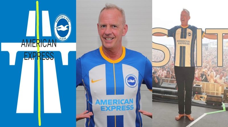
Panini though got their first. An eagle-eyed Albion supporter spotted Neal Maupay wearing it on the sticker and trading card maker’s website and before you could say “It looks like a motorway sign”, the 2022-23 Brighton home kit was all over Twitter and North Stand Chat.
We have been here before of course with premature shirt reveals. Lots of times. 24 hours before the “launch date” of the 2017-18 away kit which had been clouded in secrecy, photos of Royal Blood drummer Ben Thatcher wearing a brand new yellow Albion shirt at a gig in Australia surfaced online.
Brighton instantly released a statement, claiming that it was part of “the first ever overseas kit launch”, which had taken place in Australia on the agreed date.
The reason that the photos had surfaced 24 hours earlier was because it was that agreed date Down Under, thanks to the magic of time zones.
Except of course it wasn’t. The Albion supported who had spotted and alerted the world to Thatcher sporting a never-seen-before Brighton shirt revealed that the gig in Sydney had taken place six days before the scheduled launch.
We were expected to believe that a drummer was allowed to wear the new yellow shirt in front of a thousand people in an intimate gig in Australia nearly a week before the official reveal.
And that this was actually the official unveil, they just had not told anyone about it for six days until a Brighton and Royal Blood fan happened to notice it through a grainy, darkened photo. Nice try, Albion.
Likewise, the 2019-20 away kit being yellow and blue became leaked when a photo was uploaded from the player’s media day.
This was not quite as bad as you could see no detailing on the kits, just the colours. Little did we know that the Albion would not win a Premier League game wearing it for the next two seasons.
What has made the 2022-23 Brighton home kit leak better than both of those is the reaction to the design. Nike and the Albion have signed off a shirt so terrible that people assumed the Panini card had to be a fake.
And then several hours after the Panini card had been publicised, Fatboy Slim strode out wearing it. We then knew it was not a fake. Somebody really had thought this was a good look, presumably after designing it on a Friday afternoon at 4:50pm following four pints and nothing to eat at lunch.
The reaction from Brighton fans has been priceless and is sure to have done little to improve the mood at the Albion over Panini’s inadvertent leak.
Question one: Why have the stripes been arranged to look like there is a giant H on the front? Is this in honour of Haitch from Steps? Or Ian Buckles from Line of Duty? Was the designer interested in one thing and one thing only, and that’s bent coppers?
The H on the front did at least present the chance for some very basic Photoshoppery. This included someone surrounding the H with the letters S, I and T to spell SHIT. Another Brighton fan compared it to the sign for a motorway.
Fixed it #BHAFC pic.twitter.com/YuzlnZtwEO
— lefty (@usedtobejjm) July 21, 2022
Nice… #bhafc pic.twitter.com/G8ec5nnuzT
— David Murray (@muzzatron77) July 21, 2022
Question two: Why is there a yellow stripe down the middle of the central blue stripe? It looks like a line of piss left in the snow.
Or even worse, gives the shirt the appearance of being a cycling jersey. Newcastle United home on Saturday, climbing 1,489 metres up Le Portet d’Aspin in stage five of the Tour De France on Sunday.
Question three: The official club statement accompanying the release of the kit said it was inspired by the 2018-19 home shirt.
Why? That particular kit is largely considered to be the worst Nike have produced for Brighton. Not to mention that the Albion won only two of their final 18 games of the season, were beaten 5-0 at home by Plucky Little Bournemouth, barely avoided relegation and Chris Hughton was sacked less than 24 hours after the final game.
Not sure there is anything much from that particular campaign worth celebrating, other than a run to the FA Cup semi final. And even that was thanks to a very friendly draw until meeting Manchester City at Wembley.
Question four: How much longer are Brighton contracted to Nike for? The Albion bring up their partnerships with American Express and Nike is being a great way to tap into the US market, but this abomination of a home shirt only adds fuel to the flames for those who would prefer an Adidas, a Puma or quite literally any other kit supplier.
A Brighton home kit should be quite simple to design. Blue and white stripes. That is it. The desire to squeeze fans for every penny though by having a new home shirt every season means Nike and the Albion having to radically alter things from one year to the next, so fans will fork out another £50-odd for a design far removed from the last kit. And the Motorway Sign shirt is the result.
Or maybe this is just a clever ploy from the Albion and Nike? Design a home kit so ghastly that nobody will want to wear it, and everyone will buy the lovely blood orange away shirt instead.
Quite how they have managed to produce a stunning away number with near-universal approval at the same time as a home shirt being routinely described as the worst Brighton kit ever is quite impressive in its own way.